Case Study

Re-designing IKEA/SA’s Webstore checkout flow

Re-designing IKEA/SA’s Webstore checkout flow

Re-designing IKEA/SA’s Webstore checkout flow

Re-designing IKEA/SA’s Webstore checkout flow

a

Details

Client

IKEA

Team

Sunaina, Sidharth

Role

Sr Designer

Pain points: 

To address the considerable drop-off in our current buy flow, we aim to enhance user engagement by transforming Frog's design studio retail mobile app into an efficient web design. Priority lies in optimizing page load times for web users, ensuring a seamless experience. To condense the four screens of the mobile app onto a single web page, we will employ a strategic layout while setting a cohesive design language. This approach involves harmonizing half of the site with the existing web page style, while the other half aligns with the newly designed mobile app style, creating a visually unified and user-friendly online shopping experience.

a

Process

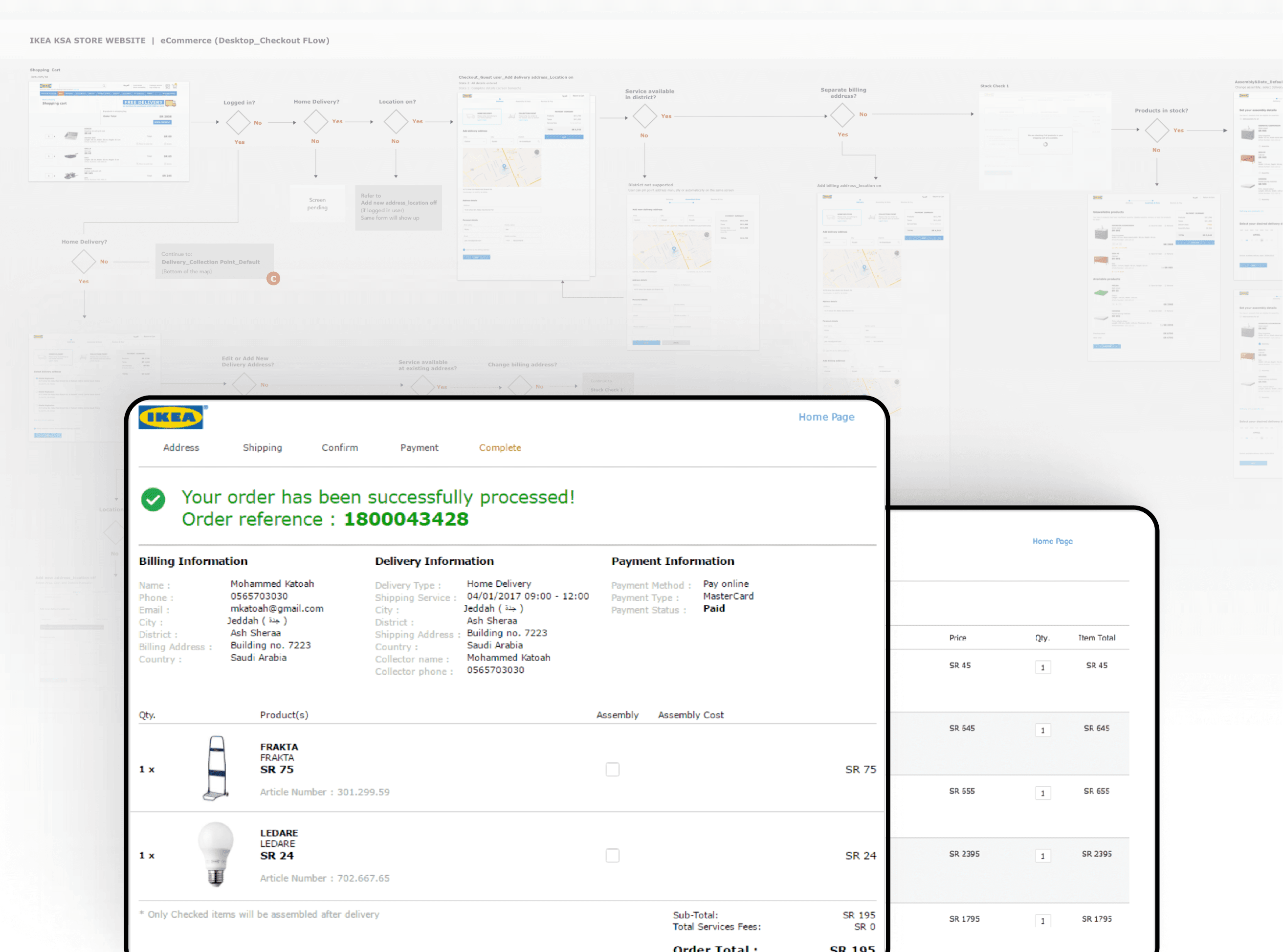
In the project, our methodology involved a comprehensive approach based on research insights. We initiated the creative process by sketching with FROG, aligning our design concepts with the identified user preferences and needs. A crucial step in this journey was the establishment of a cohesive design language, ensuring visual consistency and a seamless user experience.

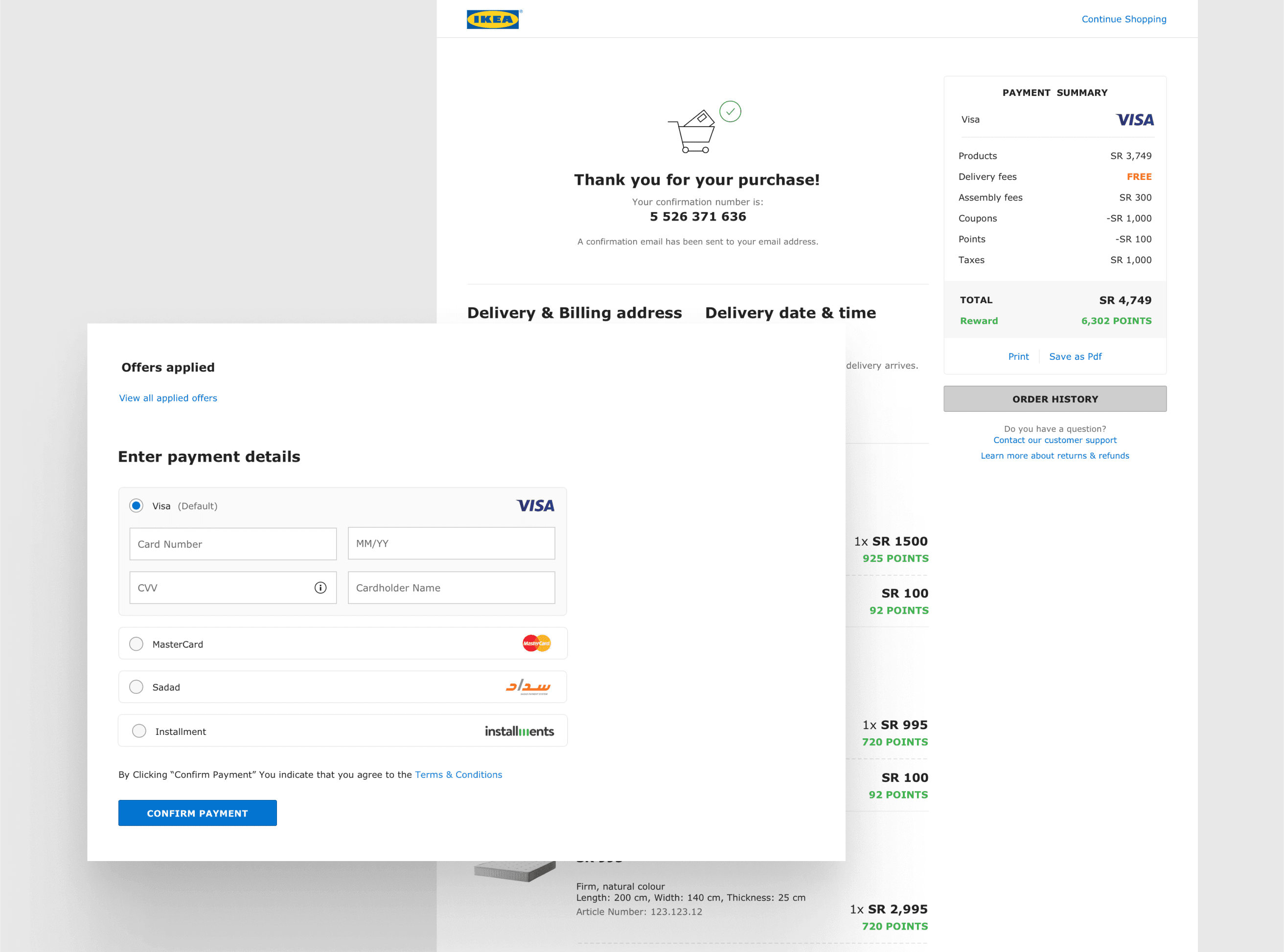
Web optimization played a pivotal role as we strategically combined the app flows to streamline and enhance the efficiency of the user journey. This step focused on minimizing redundancy and maximizing the impact of the web interface.

To ensure the success of our design, we conducted rigorous design reviews, first collaborating closely with the FROG team to gather valuable feedback and refine our concepts. Subsequently, we engaged in a design review with IKEA, aligning our vision with their objectives and incorporating any additional insights gained from their perspective. This iterative process allowed us to fine-tune our design, ensuring it not only met the project goals but also resonated with the expectations of both FROG and IKEA stakeholders.

Solution

By making the best use of the larger screen real estate on desktop we have restructured the web checkout flow to three steps

Details

Client

IKEA

Team

Sunaina, Sidharth

Brief

To address the considerable drop-off in our current buy flow, we aim to enhance user engagement by transforming Frog's design studio retail mobile app into an efficient web design. Priority lies in optimizing page load times for web users, ensuring a seamless experience. To condense the four screens of the mobile app onto a single web page, we will employ a strategic layout while setting a cohesive design language. This approach involves harmonizing half of the site with the existing web page style, while the other half aligns with the newly designed mobile app style, creating a visually unified and user-friendly online shopping experience.

Related work

Check out other
cool projects

Check out other
cool projects

Check out other
cool projects

Get this Template