Case Study
About ixigo trains
The ixigo Trains App ranks #7 in the top 10 travel apps worldwide & #2 in India in terms of downloads and hours spent in apps with ~90 million monthly active users.
India has the fourth largest railway network with over 13,452 passenger trains, with a passenger count of 24 million passengers a day. They aim to focus on the next billion users in India, mainly from tier 2/3 cities. Having said that, this is the MOST difficult audience to crack. They are hyper price sensitive, not tech savvy and use low bandwidth phones, non trusting but also forgiving & want processes to be as straight forward as possible, even if takes more time and effort.

Kick off meeting & Brainstorming
Here, design & product collaborate to breakdown the problem & understand what we are trying to solve. In this case, the data suggested that we were facing drop offs at the search listing page. The reason identified for this was that the current design was such that it was limiting the user to only check availability & not driving them towards booking. The information architecture & visual hierarchy were incoherent.
User research
Data Analysis
We first analysed our data through user session videos & tracking numbers.
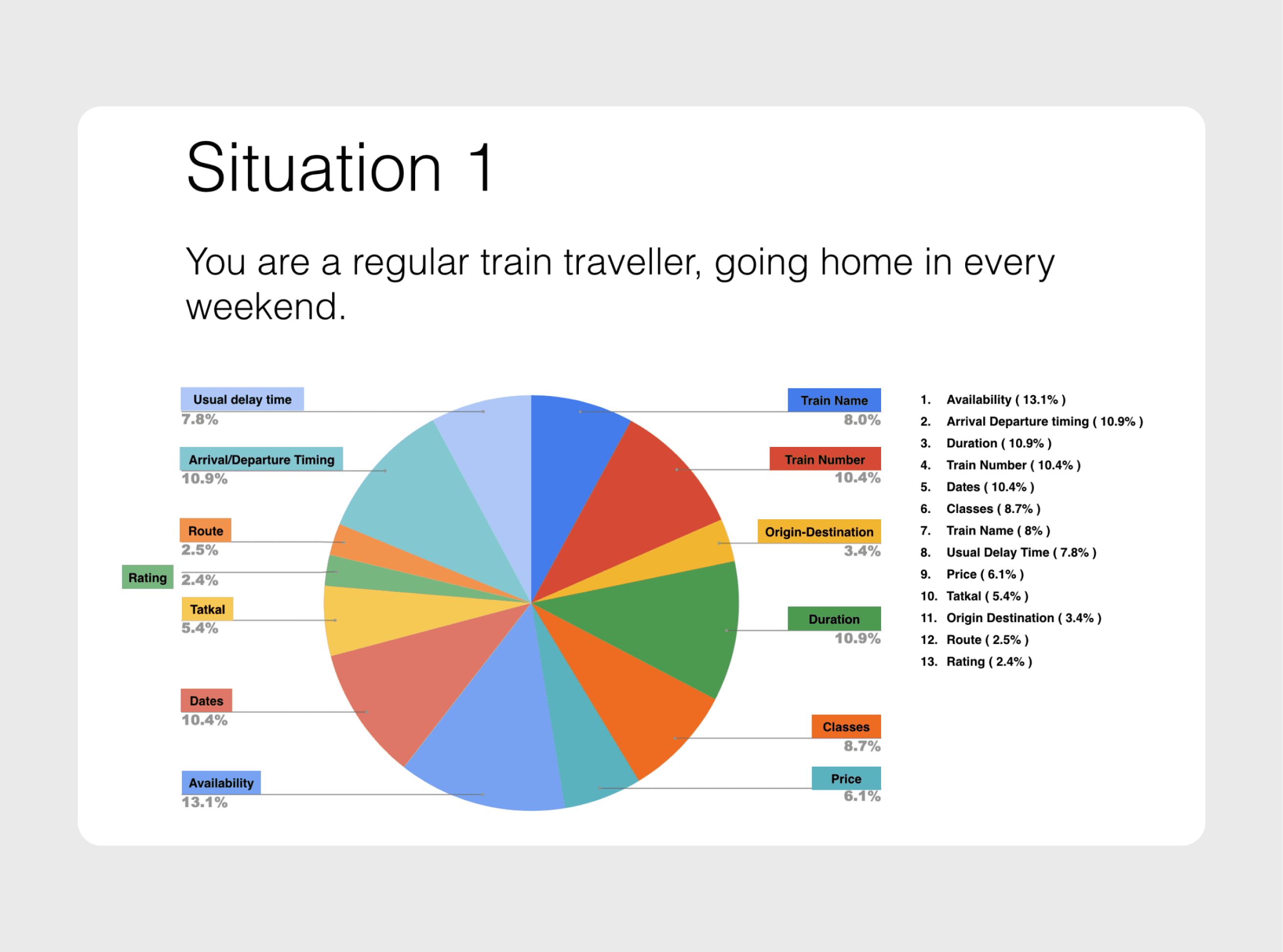
Card Sorting with real users
To improvise the information architecture, we did a card sort with the data points on the listing page, so that we could prioritise or eliminate information -
Arrival/departure time
Usual delay
Route
Train rating
Dates
Availability
Train name
Train number
Origin/destination
Duration
Classes
Price
We also chose two different personas - One who's a frequent traveller(once a week/month) and one who books occasionally (once in few months/ year).
Usability Testing
We created a working prototype & tested it out with users at the New Delhi railway station.

Arrival, departure timings & train duration were important deciding & filtering out factors.
While we did the card sorting, we also did a mini usability testing with a few of the users asking to attempt a booking in the given scenarios. We silently observed their behaviour.
Users were having difficulty finding what they wanted (eg. - class, train details etc.)
They had difficulty comparing trains
Train operations days were not understood by the user.
Considering all the insights from the card sort & data analysis, we identified all the areas(pain points) to focus on -
Comparison of trains was difficult in the existing design.
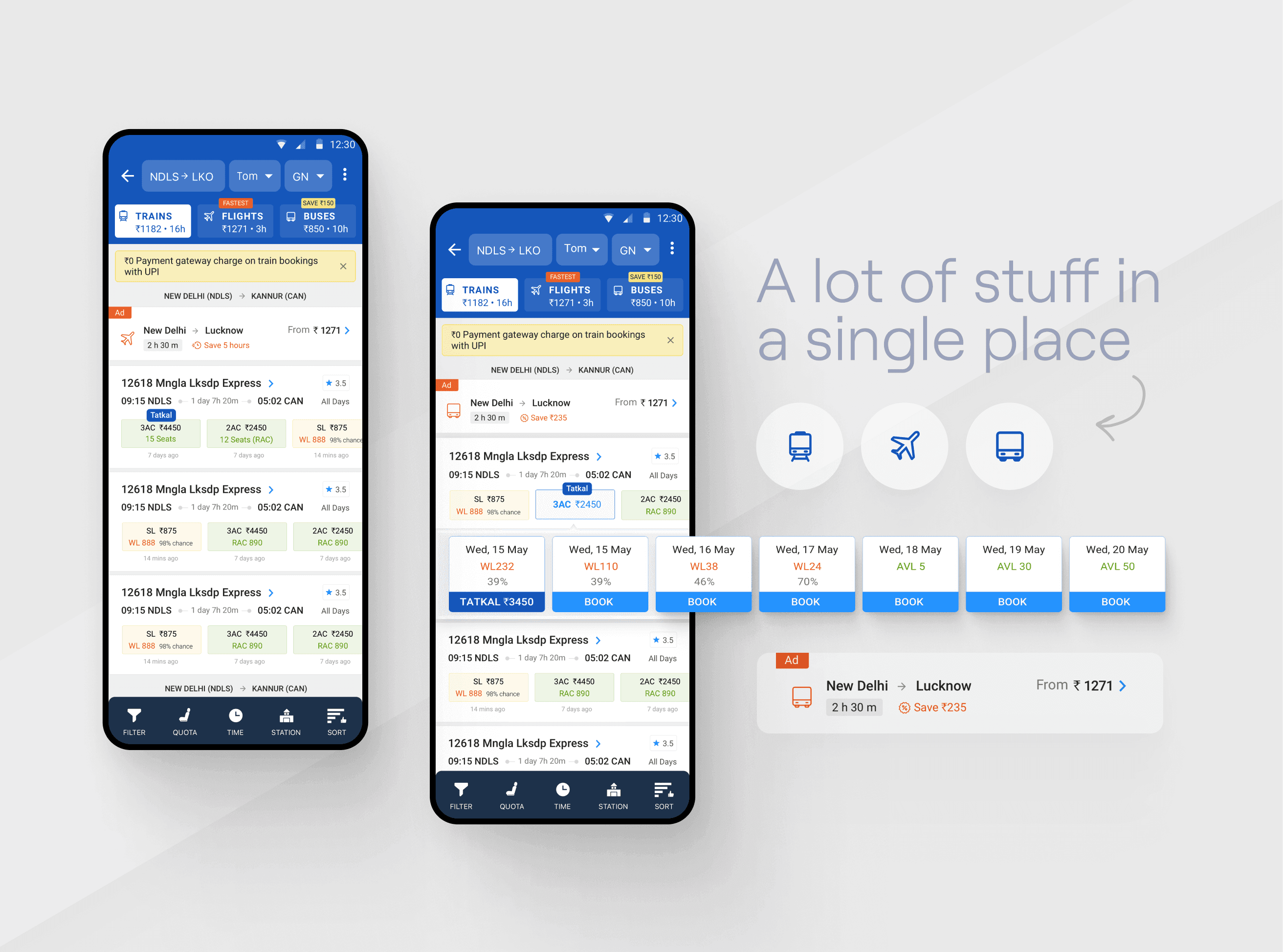
The existing page was too focused on conveying "availability" rather than "bookability". We needed to shift that focus by improvising on the CTAs, visual hierarchy & copy.
Being a very information heavy page, we would have to use better visual cues, placement & white space to enhance the usability.
Rethinking the filter tray
The train detail page could be moved into a bottom sheet & not an entire new page so that users don't have to go back & forth & also don't loose context.
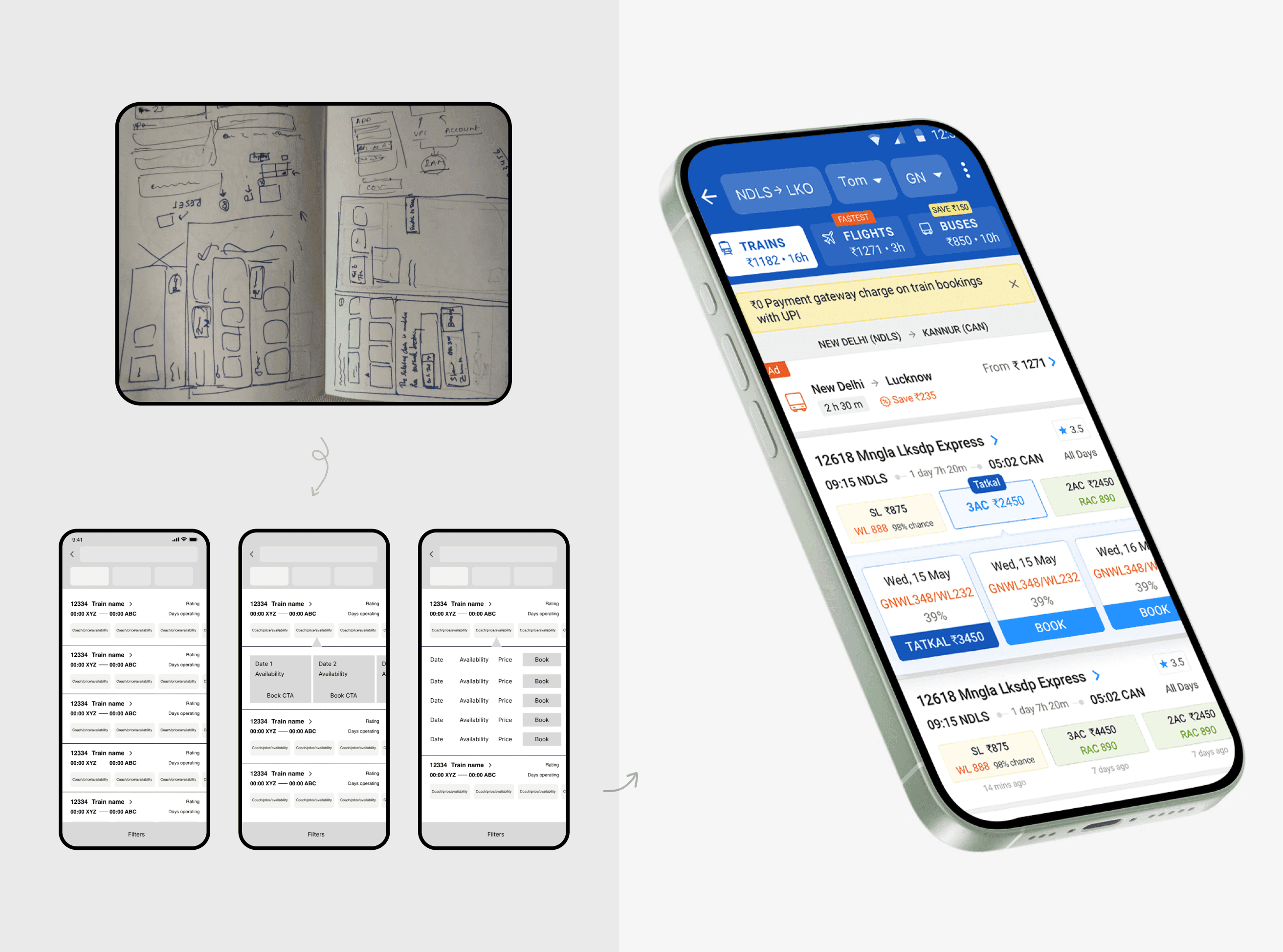
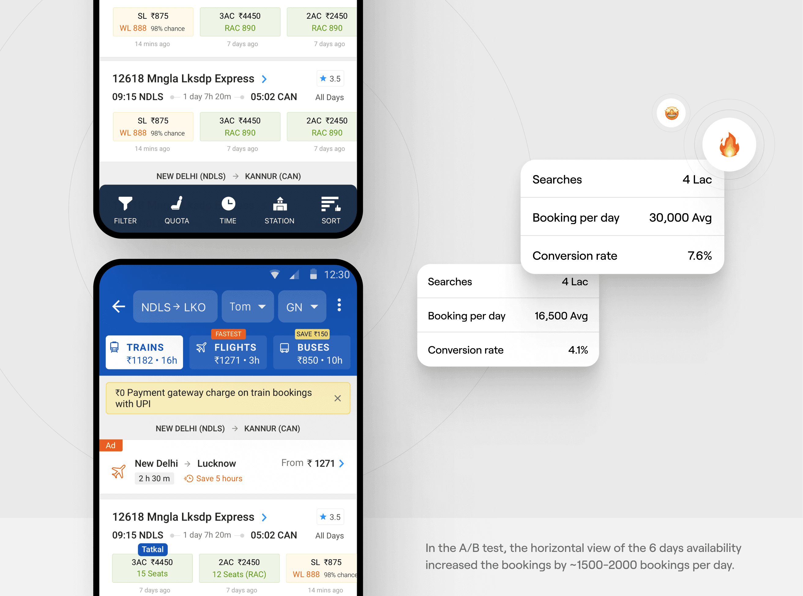
Shifting the focus to booking - The availability information was now shown upfront with the class itself. It was also colour coded based on the availability. On tapping, the detailed availability would appear, with a "book" CTA. Another advantage of doing this was that it was now easier to compare availability between trains, which was very difficult in the existing design.
Improving the information architecture- Creating a visual hierarchy with the help of font weights, colours & spacing. We also moved some information on the train details page
Better access to filters : Based on user preferences we made a few filters upfront. We decided to display all classes on the listing in a carousel format.


Related work